Error
Brand identity and packaging for a streetwear label
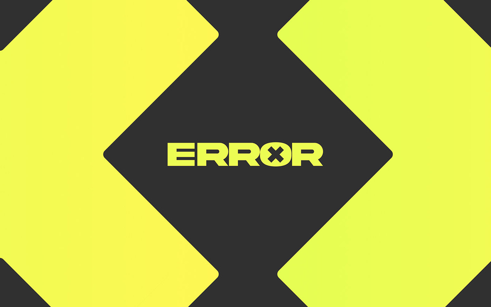
Error is a fast-fashion and street-style label. The brief arrived with most of its own answers already in it: cool and edgy, Japanese typographic elements, neon green and grey, and a mark people would recognise on a hoodie from across a room.
The mark
The logotype is built on a bracket — borrowed from the tech world the name comes from, where
[error] is a thing you read in a console rather than a thing you wear. Heavy, condensed,
flat-sided letterforms, with the O cut through by a cross so the word carries its own
failure state. Japanese characters run alongside as a secondary typographic layer rather than
decoration.
Neon green on near-black grey. The palette does most of the work at distance, which is the only distance a clothing brand is ever seen from first.
Packaging
The identity extends into packaging designed around the unboxing — the mark repeated at scale across the box faces, the diagonal bracket motif turned into a pattern, and the interior carrying the accent so opening it changes colour temperature. For a street label, the box photographs almost as often as the garment does.