Lexapar Intelligence
The design system and product surface for an AI contract platform
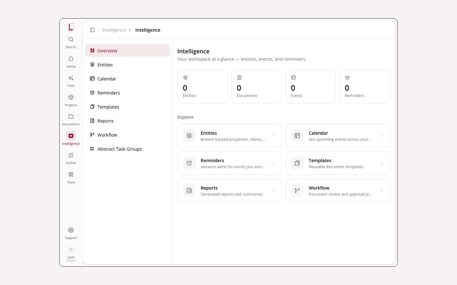
Lexapar is a workspace where legal teams manage contracts end to end — intake, drafting, redlining, approval, renewal — with AI agents doing the work in between. I’m the design engineer on it: I design the interface and then ship it, which means the design system and the application are the same job rather than two halves of a handoff.
The token layer first
The product runs on Tailwind v4’s CSS-first config — there is no tailwind.config.js. The
whole theme lives in an @theme inline { … } block, and shadcn sits on top of it with a
customised base. That’s written down in a design reference in the repo, with one rule at the
top: if the doc and the code ever disagree, the code wins. A design system that documents
intentions instead of reality stops being useful in about a month.
The agent surfaces
The interesting design problem here isn’t the forms — it’s making an agent’s work legible while it happens.
- The orb — a React Three Fiber object with custom GLSL shaders and distinct states for listening, talking, and thinking. It’s draggable and follows you across the app, so the assistant has a location rather than being a panel that appears and vanishes.
- Voice — hold spacebar, speak, watch a live waveform. Feedback has to be immediate or people assume it didn’t hear them and start over.
- The workflow canvas — pan, zoom, click-to-centre, with animated dot particles flowing along the connection lines between nodes. The chat panel tracks the same steps in collapsible progress, so you can watch it at whatever altitude you want.
- Rollout plans — the AI breaks a complex task into approval-gated steps you can review, skip, or run all at once. Nothing irreversible happens without a click.
The contract surfaces
The file browser is where most of the actual time goes, so it carries the most structure: a tabbed detail panel with an AI summary and key insights, parties and dates, a version timeline with side-by-side diffs, the approval chain, and AI actions like risk analysis and template comparison. Redlining is tracked changes with comment threads and batch accept/reject.
Auditing what shipped
I ran a full capture audit across every route in the app — home, intelligence, agents, files, integrations, workflows, playbooks — screenshotting each surface including its dropdowns, modals, and empty states. Empty states are where design systems fail quietly: nobody designs them, so they ship as a blank div with a sad sentence in it. Having them all in one folder made the inconsistencies impossible to argue with.
In this engagement 4
-
 Design system The token layer and component library the whole product is built on 2026
 - Agent surfaces A 3D orb with shader states, voice capture, and a pannable workflow canvas 2026
- Contract lifecycle Intake, drafting, approval, redlining — the surfaces the work actually happens on 2026
- Marketing site The public side of the platform 2026